Personalization is what empowers retailers to create a 1-1 relationship with customers online. By tracking engagement and other KPIs, you can quickly take stock of how are you doing with those relationships.
The new RichRelevance dashboard is the perfect tool for putting richer reports with more data at your fingertips, so that you’re always in tune with your site personalization. The new dashboard pulls back the curtain to showcase your data in a more digestible, visually appealing way. When your reports are eye-friendly, organized and automated, you can assess the status and impact of your site personalization within minutes.
Here are three quick ways to dive into the dashboard.
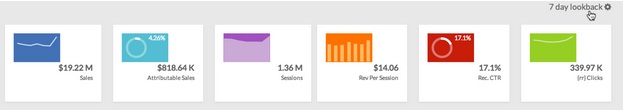
1. Check and share the vitals
Our brand new Lookback Summary is a detailed tile band that displays an at-a-glance summary of your sales and recommendation metrics. You can configure the lookback period to be a day, week, month or any number of days up to 90. You can also click any tile to access an expanded view of the graph. Take a screenshot and share metrics with key stakeholders in just a few clicks!
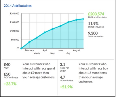
2. Track the value add
The Attributables Report tile is another new addition to help you track the impact of RichRelevance recommendations on your site–specifically through change in average order value (AOV) and items per order (IPO).
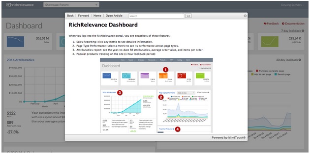
3. Access more detailed data and then some
Other significant enhancements include the Page Type Performance tile, where you can view the performance of different metrics for various pages on your site, and the Viral Products tile, which displays the most viewed products and takes you to detailed Merchandising Reporting. Best of all, feature documentation can be accessed within the feature page itself.
Try today
The new RichRelevance dashboard is designed to upgrade your experience and provide site health visualization, easy controls and usability improvements throughout. If you haven’t done so already, we encourage you to log in to your dashboard and play around. We believe that in order to provide you with more of the tools that you love, we need to work together. So, tell us what you’d like to see in the next set of improvements using the comments section below.
Malcolm Gladwell recently popularized the term ‘outlier’ when referring to successful individuals. In data terms, however, outliers are data points that are far removed from other data points, or flukes. Though they will make up a small portion of your total data population, ignoring their presence can jeopardize the validity of your findings. So, what exactly are outliers, how do you define them, and why are they important?
A common A/B test we like to perform here at RichRelevance is comparing a client’s site without our recommendations against with our recommendations to determine the value. A handful of observations (or even a single observation) in this type of experiment can skew the outcome of the entire test. For example, if the recommendation side of an A/B test has historically been winning by $500/day on average, an additional $500 order on the No Recommendation side will single-handedly nullify the apparent lift of the recommendations for that day.
This $500 purchase is considered an outlier. Outliers are defined as data points that strongly deviate from the rest of the observations in an experiment – the threshold for “strongly deviating” can be open to interpretation, but is typically three standard deviations away from the mean, which (for normally distributed data) are the highest/lowest 0.3% of observations.
Variation is to be expected in any experiment, but outliers deviate so far from expectations, and happen so infrequently, that they are not considered indicative of the behavior of the population. For this reason, we built our A/B/MVT reports to automatically remove outliers, using the three standard deviations from the mean method, before calculating results, mitigating possible client panic or anger caused by skewed test results from outliers.
At first glance, it may seem odd to proactively remove the most extreme 0.3% of observations in a test. Our product is designed to upsell, cross-sell, and generally increase basket size as much as possible. So, in an A/B test like the above, if recommendations drive an order from $100 to $200, that’s great news for the recommendations side of the test – but if the recommendations are so effective that they drive an order from $100 to $1,000, that’s bad news because a $100 order has become an outlier and now gets thrown out.
In order for a test to be statistically valid, all rules of the testing game should be determined before the test begins. Otherwise, we potentially expose ourselves to a whirlpool of subjectivity mid-test. Should a $500 order only count if it was directly driven by attributable recommendations? Should all $500+ orders count if there are an equal number on both sides? What if a side is still losing after including its $500+ orders? Can they be included then?
By defining outlier thresholds prior to the test (for RichRelevance tests, three standard deviations from the mean) and establishing a methodology that removes them, both the random noise and subjectivity of A/B test interpretation is significantly reduced. This is key to minimizing headaches while managing A/B tests.
Of course, understanding outliers is useful outside of A/B tests as well. If a commute typically takes 45 minutes, a 60-minute commute (i.e. a 15-minute-late employee) can be chalked up to variance. However, a three-hour commute would certainly be an outlier. While we’re not suggesting that you use hypothesis testing as grounds to discipline late employees, differentiating between statistical noise and behavior not representative of the population can aid in understanding when things are business as usual or when conditions have changed.

Continuing our series on “2013 Season of Shopping Insights,” we analyzed shopping behavior in the top 50 cities across the US (including mobile share of views, and mobile share of sales) and uncovered some regional shopping patterns—and anomalies—that may surprise you.
Which cities lead the way when it comes to conversion, AOV, and social activity? What are some key shopping trends in our great states of Texas and California?
Top 5s
| AOV | Conversion Rate | Social Referral Percentage |
|
|
|
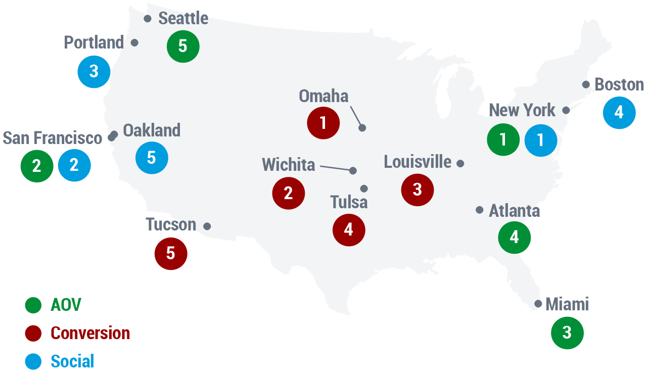
Texas Trends (AKA Austin “Oddities”)

- Mobile Sales. Mobile accounted for over a quarter of sales in Dallas, and over 20% in Houston, but was merely average in El Paso and Fort Worth. Surprisingly, Austin lags in mobile.
- Shopping Behavior Similarities. Dallas, El Paso, Fort Worth, and San Antonio are all similar, but Austin—once again the odd one out—is closer in shopping behavior to Portland than its Texas sister cities.
 California: Coastal City Surprises
- Long Beach is closer in overall shopping behavior to Phoenix than to LA.
- San Francisco is more like Atlanta than like Oakland in its shopping behavior. (SF has higher AOV, but Oakland has the greater share of mobile traffic and sales.)
Methodology: This study uses data about the top 50 US cities (by population) from over 100 sites on Thanksgiving Day (2013-11-28). The data consists of over 5.5 million sessions and 200 thousand orders.
More from the 2013 Season of Shopping Insights series:
- Shoppers Less Responsive to Retailers’ Day-Specific Promotions though Cyber Monday Gains Ground
- Insights Across America
As a data-driven company that derives relevant shopping insights from the billions of shopping sessions we touch each year, we wanted to assemble a series of interesting take-aways that showcase notable trends of the all-important holiday shopping season.
Just as the holiday season is about feelings as much as shopping, per se, so too holiday data can be seen for the picture it paints about where we find ourselves as 2013 draws to a close. Anthropologists have always understood that shopping, giving, and exchanges of goods say much about a culture. While our specialities are computer science, engineering, and marketing, we invariably find what data can tell us very interesting … and we hope you will, too.
Please join us as we explore the trends we’re seeing during this December, starting with this first nugget:
Seasonal Shopping Insight #1
Shoppers Less Responsive to Retailers’ Day-Specific Promotions though Cyber Monday Gains Ground
 US consumers appear to be spreading out their online shopping visits and spending over the entire holiday period, rather than concentrating their activity on key days such as Black Friday and Cyber Monday—perhaps to the consternation of retailers who devote massive marketing effort to lure shoppers in-store and online on select days. (See a related story in Internet Retailer, which used our data to discuss mobile e-commerce trends over the start of the holiday season.)
We reviewed comparable sites, year-over-year, examining the share of revenue, orders, visits, and other key metrics over the 11-day period from Thanksgiving through Sunday, Dec 8 (using comparable days for 2012).
On the plus side:
- Conversion rates are higher this year, especially in the post-Cyber Monday period.
- Average Order Value (AOV)—the average amount a shopper spends—is higher compared to last year for the 5 key shopping days from Thanksgiving to Cyber Monday.
But the share of both shopping visits and orders is less on those five key days:
- In particular, Black Friday in 2013 had 13% of the 11-day orders, down from almost 16% in 2012.
- Each of the five days in 2013 has a smaller share, and each of the post Cyber Monday days has a larger share of visits, when compared to the prior year.
In short, it looks as if the shopping period is spreading out—and consumers are resisting the siren song of Black this or Cyber that. For retailers, this may presage a much more competitive period until the 25th.


More from the 2013 Season of Shopping Insights series:
- Shoppers Less Responsive to Retailers’ Day-Specific Promotions though Cyber Monday Gains Ground
- Insights Across America
Working in consumer innovation, I have the unique opportunity—and dilemma—of deciding whether or not to invest my team’s energy on the dozens of brilliant ideas that cross my desk each week. Many ideas are attention grabbing, but don’t drive revenue; others are ridiculously interesting, but unrealistic for any retailer to implement. Rarely is something both pioneering and substantial in terms of delivering real returns for our retail clients.
But when Pinterest rolled out their first APIs earlier this month, I was more excited that I had been in a long time. Because while social networks always generate a ton of buzz, Pinterest stands out for its singular stance of letting folks effortlessly curate their point of view through their amazing boards. Being able to broadcast a highly personal inspiration and inspire a broader audience was instantly compelling for me.
So when asked by one of our retail partners “if you could do anything with Pinterest’s APIs, what would you do?” I jumped at the opportunity. Naturally, there were a few restraints due to timing: this could not involve any engineer hours from either the retailer or RichRelevance and the end result had to look good and be amazing (of course).
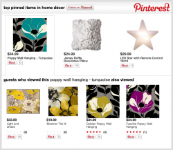
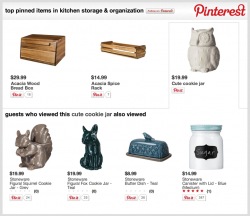
In the end, my team decided to build a POC to showcase top pins in a category, with recommendations off of those pins (based on product popularity) driving further product discovery.
We called Pinterest’s APIs to get “top” and “recent” pins for the retailer’s domain, and mashed up that data with RichRelevance’s APIs to map category- and product-level information in order to build a table of all pins to categories offline. From this, we built mini JSON databases for each category that had Pinterest info, retailer info and pricing. So now, when a customer visits a category page like Home Décor, our recommendations widget asynchronously loads the Pinterest pin data for that category ID from our CDN, and we display top pinned items in Home Décor, along with recommendations for similar popular products. A great “v1” proof-of-concept!
Eighty hours and one week later, we were up and running. Along the way, I gleaned a few lessons in on-the-fly, homegrown development:
- You don’t know how to build something until you’ve done it three times. Only on version 3 does it start looking like you might have a good product. Having a flexible, agile team also gets you closer to a product that the market wants. Be delighted with v1, but know it’s not built right yet.
- Test in Internet Explorer last. If you spend all your time fixing problems on IE before iterating on core ideas, you’ll spend too much time dealing with Microsoft issues. Chrome has a robust set of developer tools that will quickly get you going, so leave the 3-4 problems that exist for IE at the end.
- Use the console.log and console.dir in your browser’s developer tools; they are your best friends for rapid JS app development. In addition to letting you debug your code along the way, they work seamlessly in Chrome, Firefox and Safari. You can verify code while the page is loading, set flags for when functions are called, and even print out contents of a JS array to verify data integrity.
- Hardware is cheap. Over-invest in hardware when doing something customer-facing. For this POC, we spun up a 2GB dual-core virtual server for $150/month so that we could scale up to 4GB of memory if needed to. Don’t let hardware be the reason that your POC fails.
- Sometimes you just need to wipe your screen. One early morning at 3 AM, I was re-factoring a JavaScript function; the console kept throwing an error, stating that I should have a semi-colon on line 219, and not a colon. After much head scratching and denial, I realized I had a food crumb on my screen that made a typo in the code look like a semi-colon. In the wee hours, remember that there’s no such thing as magic. Sometimes it’s just a crumb on your screen.
Going through this on-the-fly innovation led to an exciting way to marry social innovation and personalization to merchandise landing pages, and we can’t wait to leverage our learnings even further.
If you’d like to learn more about how to do this, please reach out to your account manager today!
By Doug Bryan, Data Scientist, RichRelevance.
 The oldest and largest marketing data aggregator, Acxiom, recently opened up its database to let individuals see and edit the data that the company has collected about them. Data scientists and marketers have been viewing the data and, often, chuckling at its inaccuracy. Acxiom admits that up to 30% of its data is wrong, and yet it’s the industry leader. How can Acxiom make so much money with data that’s only 70% accuracy? Simple: Most marketers’ data is worse, and in the land of the blind the one-eyed man is king.