Tracking the Online Customer’s Path to Purchase: Key Findings and Takeaways
 The RichRelevance Analytics group recently conducted a series of studies for several of our larger, premium retail clients to explore customer behaviors and identify the greatest opportunities for optimization. The results of one such study*—which I am sharing here today, revealed some pretty astounding insights for this particular customer’s online shoppers.
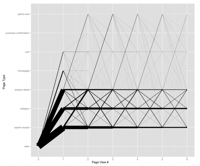
Home page “schmome page.” The home page is for all intents and purposes the premier online brand presence for a merchant. It gets rendered more than any other distinct URL within the merchant domain and is often the gateway for the most loyal customers. Yet with only 4% of inbound sessions and 1% of total page views, you now know why that home page promotion didn’t do so well. These numbers paled in comparison to the search page, which was the landing page for almost 40% of all sessions followed by the category page at 26%, which narrowly edged out the item page at 25%. The lesson here? A simple UI or merchandising enhancement of virtually any dynamic page template will always be a more efficient allocation of resources than investment in the home page.
Customers are not finding what they need when referred to a product detail page. For this particular merchant, over 54% of visitors that land on product detail pages exit immediately. Compare this with a 29% bounce rate on the search results pages and a 21% bounce rate on category pages. Search engines and merchant SEO teams are to blame for this one, unfortunately. What makes this still more devastating is that these customers–the ones that land initially on the product detail page–are the most likely to add an item to the cart during their sessions. How can we plug this hole? For starters, modifying the landing page template to include a merchandising zone of related products could mitigate the exit risk by providing shoppers with an alternative to Google/Bing/Yahoo’s suggested best match. In addition, at over 12% of all page views, the item page is a prime candidate to explore monetization opportunities.
Shoppers who browse category pages are most likely to continue browsing category pages; the same is true for shoppers that search. In both cases, this “nesting” behavior was often caused by refreshes and back button clicks; however, pagination functionality (i.e., advancing to a second and third page of results) was found to be the primary driver, indicating that there may be an opportunity to experiment with the sorting functionality for both search results as well as category pages. At the same time, something that differentiates browsers from searchers is their propensity to drill into a product. While searchers drive more product page views as a function of volume, browsers represent the segment that is more likely to click through to a product page—by almost 50%. This is surprising, given that we expect searchers to be more product-driven since search terms are evidence of a clear objective in their shopping agenda. Nevertheless, merchants across the industry are designing search and category pages as two markedly similar (if not identical) experiences, generally comprised of a product grid with attribute-based refinements (e.g., a result set of TVs with brand, price and screen size filters). However, I’d propose that the data uncovered in this case may warrant a new consideration for merchants: to create a separate user experience, leveraging user, brand and product affinity, that exploits these category browsers’ high propensity to proceed down the conversion funnel.
In closing, I’ll raise an important caveat: the findings here do NOT apply to all merchants, not even the competitors of the large multichannel merchant profiled in this particular study. With terabytes of data like this left to be mined, we’re going to be very busy uncovering more golden nuggets in our quest to optimize our clients’ online shopping experience. Stay tuned…
Web patterns on a major US merchant. The thickness of the path corresponds to the count of distinct sessions.

*We took a random sample of sessions and aggregated behavior by page-to-page transitions between what were believed to be the most significant page types in the purchase funnel: home page, search results, category, product detail, add-to-cart, cart, and purchase confirmation. We then described the data using visualization tools in our favorite free statistical environment, R.


